Responsive Web Design and Why You Need It.
 Is your website mobile friendly? If you don’t know the answer to this, then the chances are that it is not. But people trying to access your website on a mobile phone or tablet will certainly know if your website is mobile friendly or not.
We’ve all visited a website on a mobile phone which doesn’t display properly, it can be incredibly frustrating. You have to scroll around horizontally and vertically, and pinch the screen to see the web pages. As it isn’t easy to do, chances are that eventually you get fed up, give up and get put off visiting that website again.
A few years ago this would not have been a huge problem. People would just look at a website on their mobile phone to get an idea of a site, and would then look at it properly when they got back to their office or home and could access a desktop computer. They would not have purchased items such as train tickets online through their phone because it was too hard.
Those days are gone.
People now expect to be able to do everything on the go because it is very easy, or should be. Your clients and prospects now expect to find out about your services on their smartphone, iPhone, tablet or iPad, whether they're sitting on a train or at home in front of the TV.
7 out of 10 people in the UK now own a smartphone, and websites are seeing the number of people accessing their site through mobile devices increasing by 100% each year. It is predicted that soon there will be more active mobile phone accounts in the world than there are people and that surfing the internet on a mobile device will overtake surfing on a desktop PC.
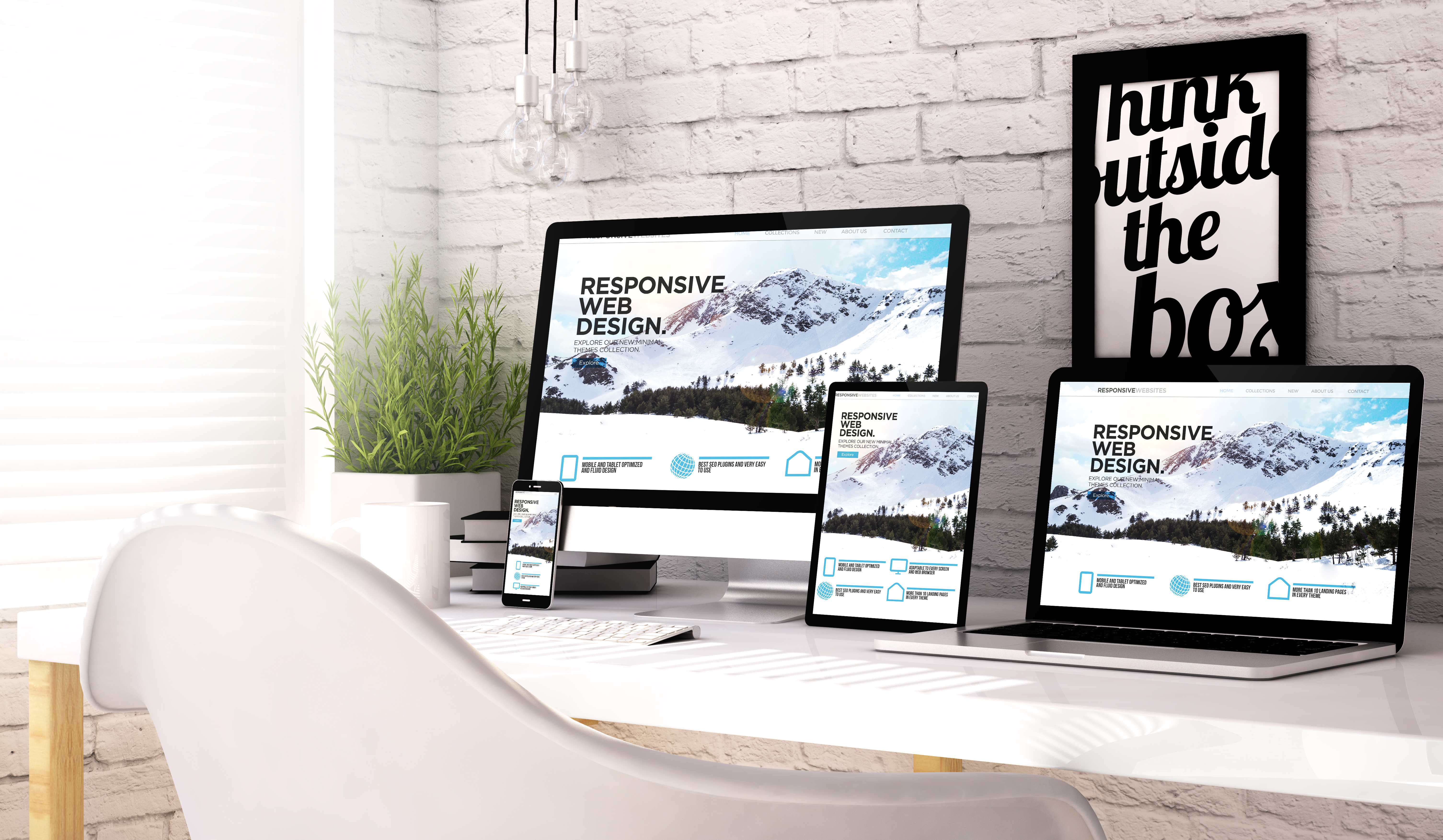
So, it is no longer enough to have a website that looks great on just a PC, it needs to look great on the go as well. Take a look in Google Analytics at the percentage of visits to your site from mobile devices – you will probably be surprised. A professional web design company should be able to offer responsive web design (i.e. make it mobile friendly) as standard for a new site, and should also be able to make your existing site mobile friendly. This means that they will make your website intelligent enough to know what size screen is being used to view it on so that it will automatically adjust to fit it perfectly – in other words your site will appear "tailor made" for whatever size screen your customers and prospects want view it on.